Tuesday, 20 October 2009

Woodblock...

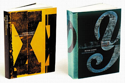
I have been experimenting with woodblock type, and using mismatching letterforms. I have found a few examples that have helped to inform my design work, as well as provide a but of inspiration. I also feel a little spurred on by these designs, as they are so simple but beautiful, and I know that something really great could come out of this experimentation.

I found these images at welovetypography.com, wordsarepictures.com and a google search for 'woodblock type'


Cosmetics Galore...

I have found a new packaging website that I never knew existed! I trawled through it for a while a found an array of cosmetics packaging that I felt could help me to develop my packaging design work for Boots Expert (which I feel has stalled a little).

All of these images are from Packaging of the World


Monday, 19 October 2009

Postage...

I have looked at the restrictions on the sizes of letter/parcel for certain stamp sizes and the cost of exceeding these. The image below shows the sizes acceptable for the stamps. I want to make sure that the majority of the cards I design will be able to be sent using a first or second class stamp, and not a more expensive option.

Bob's Your Uncle...

I visited the Leeds City Museum last week, to kill some time whilst waiting to meet a friend and I came across these cards in the gift shop. I like that they are very simple in their use of colour and type, but the phrases/greetings are the main focus, and allowed to take centre stage. These designs work because they are not too dressed up or over the top, there is a balance between design and meaning.

Tuesday, 13 October 2009

Cake & Co Positioning...

This map shows where in the market the Cake&Co cake shop is positioned, and how it compares to other products within the market. It is easy to see where the brand should fit, and how it can be designed to fit within it's section of the market...

Cosmetics Positioning...

This map shows where within the market the Boots Expert brand will/should fit. The use of this map is to show this, and then consider how the other products are design in comparison with their quality and price...

Friday, 9 October 2009

General typings...


These images are the remnants from my internet research which didn't fit into another category. I realise it's all a bit of a jumble, but there are things in here that are really going to help me with my design work.

1. These cards are very imposing, but the bold colours and letterforms work really well. Each card has not been overloaded with colour, and the embellishment has been kept to a minimum. There is no real message on the front of the card, this is left for the sender to write on the inside.

2. This is a slightly odd card, the monochrome is a bit disappointing, but the shape of the letters and the sort of squished composition makes up for this. The type has a more hand rendered quality that most of the other designs i have been looking at, but the quality of the letters works well.

3. These two invitations are very simple in their use of text. The placement of the letters is good, but they look a bit like they're floating randomly at the top of the page. It is however a good starting point for a design, but there are considerable improvements that could be made.

4. This is so simple, plain, pale, unembellished; but it is lovely. The subtle contrast between the paper and the type is lovely, and the shape of the letter, and the way the two words are tracked to fit perfectly is great. Simple and effective (maybe a little boring?)

5. As a card I don't like this design very much, but the way the type has been laid out is what I am interested in. The words have been set so that they sit perfectly within the square, and the mixture of colours for each letter helps to balance the hierarchy of the words.

6. Letterpress -again! I do like the quality of this design, the mix of just two colours, and the bright bold text. Very sweet, and suited to a valentines card.

7. Letterpress! Much more interesting layout and mixture of typefaces, lots of expression and good contrast between the ink colours and paper stock.

8. The mis-matched jumble of typefaces, colours and words is a bit crazy, but the overall feel and mood of the card is great. I like that a variety of serifs, sans serifs, script and outline fonts have been used, as well as flipping the words around so that the read from lots of angles.

9. This piece is good in the sense that it uses a variety of typefaces, but the type looks stretched and slightly squashed in places. Not very exciting really.

10. This hand drawn type piece is lovely, I really like the mixture of typefaces and colours and the way some of the letterforms are embellished. Overall it is a very over-the-top design, but it's pretty and the mis-matching works quite well.

11. This is my favourite piece from all of those shown. I love the simplicity of the design, the use of just one colour which is then mirrored in the envelope. The type itself is well set (sort of centred which I usually hate) and the inclusion of the small illustration is good. The texture of the design looks like an engraving, or possibly letterpress. The design is very cleanly printed and the mix of typefaces is not overly obvious, but is very effective.

Thursday, 8 October 2009

Consider this a courtesy card...


Gramkin Paper Studio

I found these lovely cards on an Etsy website. I love that they're beautiful and pretty, but the phrases and slogans are so mean!
The typefaces are put together well, and provide the decoration for the card, as well as the message. I think that the overall idea is to have something beautifully crafted, but in essence it's a rejection! I think that these types of designs can help me to find fonts that work well together and create something, rather than fighting for attention.

Christmas Greetings...


1. This Noel card is very simple, but very effective and pretty. I like the way the letters overlap to create areas of brighter colour, and that the type is not overly embellished.

2. The christmas tree shaped text seems a little bit done, but I think there is something effective going on. The combinations of typefaces do not work that well together and don't create a great overall image. The message is clever but I think that the christmas tree is a bit of a weak way to communicate it.

3. I like the simplicity within the lowercase 'christmas', and that the patterns within the letterforms provide the decoration. The bow across the bottom is pretty, but maybe a bit pointless. I feel that this would appeal to a varied audience; children adults, mainly women but it is a pretty general card.

4. This letterpress style seasons greetings card is interesting, nice, brightly coloured. I think that maybe it's too done, the different sizes of type, texture of the letters, but I do like it. I think that it would appeal to those who want something a bit different for their christmas cards, but not too over the top, or ambiguous.

5. Similar to the previous card, the letterpress style is apparent, and the overlapping letters work well. The mix of colours and phrases is good, not too much, but interesting enough to make the design worthwhile.

6. The mix of type faces work together here, and I think that is because there is no mix of colours or textures to confuse the design or make it seem overly designed.

7. This concertina design design works really well - i love that it sort of reads in two directions, and that the colours are so un-christmassy that it feels like a proper card rather than a christmas necessity.

8. Letterpress-ish again; the mix of typefaces is good, and the pale colours make the design easy to take in. I think that it is possibly too pale, and maybe doesn't actually make a lot of impact. It could be better, but it could also be worse!

9. This last card has a more handmade feel, the contrast of type is good. I like the colours, though they are a bit 'new baby'. I think that using colours that may be a little unexpected is a good thing, but they need to be the right colours.

Birthday...


1. This card is rather expressive, and has a mixture of typefaces, colours and weights. The overall feel isn't exactly of a 'happy' birthday but more of a ransom note. I think that as a piece of design it is interesting, but not exactly greeting card material.

2. I really like the hand drawn quality of this cards. The background appears to be very simple with just two colours, but the eclectic mix of shapes and the texture they provide make it more than it could have been. The type element is very plain, the variation in size and weight works quite well, and enhances the handmade quality.

3. These bottom three cards are from Paperchase; relatively similar in their bold use of colour and text. The message is also rather simple, repeated several times, and with the mixed typeface cards, it works quite well because they're so decorative. A little over the top and bright, but as cheap cards they're pretty good!

Type Greetings...

I have started looking at existing designs for greetings cards and gift wraps that utilise type as their main component of communication. Initially I didn't think that I would find an awful lot of stuff out there, but contrary to this there is an abundance of typographic greetings available for almost every consumer.

The images shown here are from a primary research excursion, which involved stealthily taking photos of products without the people in the shop getting angry (which they didn't!). I visited Clintons, Marks and Spencer, WH Smiths and Paperchase...


WH Smith tends to cater for a range of consumers. They have products that are at the higher end of the market, and some toward the lower end. There is a definite feel to the type of cards WH Smith sells, most are not particularly exciting, and some badly designed (see 'Mary had a little lamb...' above). Those that are more exciting, and have a better level of design are usually those designed by other companies (see Scrawl montage, and the Emma Bridgewater cream and black gift wrap). Overall WH Smith seems to be following the trend rather than setting it.


Paperchase is a higher end high-street brand. Their products are known for being interesting, fashionable and having well thought out designs. Their greetings cards make up a large proportion of the products they sell which is understandable when they are eclectic and artistic. The selection of type based cards was very good, they have some designed by outside printers and some designed by their own in-house paperchase designers, which provides a good mix of lower and higher priced cards. I feel that Paperchase really sets the bar when it comes to fashionable stationary, a definite trend setter.


Marks and Spencer is an unlikely place to think about buying gift wrap and cards, unless you purchase items like food and homewares as well, rather than just clothing. M&S have been expanding their brand for some years now and incorporating cards into their range has been a good investment. Their designs sit on several levels of the price ladder, with some coming in around the £1.50 mark, whilst other more elaborate or embellished cards are around £3-4. Their designs are interesting, some similar to Paperchase, and others more suited to the older person buying for a younger audience. They have a very good range, appealing to most buyers and audiences, and with M&S you know the quality is going to be high.


Clinton Cards is one of those shop that I sort of hate, but am appreciative of. Their main selection of cards are all rather twee and sickly (with those terrible verses written inside!). The selection of type based cards was low, considering how many different cards they sell. The designs are all rather over the top, bright colours, with layouts that could be better. Their gift wrap is suitable, but not amazing, it could be so much more eye-catching and exciting. They have recently started producing a range of quite lovely, more modern and fashionable cards, but for a lower price (all around £1-2), which I think is very reasonable. For example the 'Birthday' type card with multi-coloured letters is on sale for £1.30, not expensive, and not a bad card. Overall there is room for improvement!

Tuesday, 6 October 2009

Boots...

The sustainable packaging brief is based on re-designing a Boots cosmetics brand. I have been looking into some of their other own brand designs to get a feel for what they currently do...


The No7 Make-up brand is priced relatively high-end. The design is very simplistic and uses few colours, keeping the brand as a smooth and sleek set of products.
The Botantics range is more competitive, but considering the ingredients a medium price is understandable. The design is simple, but effective and has variation throughout the brand which keeps the design interesting.
The Essentials range is a basics value price range, the design is simple, and makes the no-frills approach to cosmetics obvious.

Sustainable Packaging...

I have been researching my first brief for Design Practice 3, sustainable packaging design for a cosmetics range. I've used two websites to locate lots of different types of cosmetics packaging that can inform my design work for this project. There is currently a lot of research, but hopefully over time it will become more focused onto one particular style of design.

All of these are from either The Die Line or Lovely Package...

These fragrances all have exactly the same design, with only the colour as the varying element. I think that they're lovely as a set, very simple and understated, but one their own probably a bit dull.


I really like the label designs for these products, the colours are bright and inviting and the layout of the labels make the information easy to locate and read. Very sensible, but very simple and impacting.


This is a very refined package design. The colours are understated and chic, and the product is clearly very high-end. I think that the simplicity of the design shows that the product doesn't need to shout about it's assets, these are implicit from the design.


These designs are much more modern, but look a little cheap. The colours will make the product stand out, but the overall design is a bit loud and in your face - however, this may be suitable for the brand, and the tone of voice it wants.


This design is eye-catching and has good continuity across the products, but becomes more individual with the spot colours. The design is type based, which looks clear and 'no frills-esq', but the logo seems to be oddly out of place. It doesn't seem to tie in with the rest of the design, which is disappointing, but it doesn't ruin the design.


The type based design for these products works really well. The spot colour against white with the black type creates a very clean and simplistic design. The phrases rather than just basic product information gives another dimension to the product, and makes it feel more personal. The phrases are however a little weird - I think the products might be hotel toiletries, but I'm still not totally sure it makes sense.


This package design is very 'authentic'. For some reason I feel I could trust Co. Bigelow, they look like they know what they're doing, and probably have a bit of experience when it comes to toiletries. The simple colour combinations with numerous typefaces works quite well, even if there is a total overload of information!


This package seems to be a set of different types of hair gel/wax stuff. I am not totally sure why someone would purchase a large selection of hair products that probably all do the same thing.... The type design is quite nice though, its a bit modern and quirky, and the coloured swirls under the text are subtle, but make the black text pop.


I like the simplicity of this design, and the variation in the colour of the bottles is very subtle. The overall effect is very professional and informative, but there is a lot of text on the front of the bottle. I would expect there to be no info on the back, and if there was, wonder slightly as to what all the stuff on the front is for, and whether it is necessary or just bullshit?


I love the shape of these bottles, it is totally unexpected and quirky. It is nice that shape is allowed to speak for itself, and the information and logo are really low key. The colours are simple, subtle and nicely muted. It all looks very clean.


The illustration is what makes these bottles appealing, otherwise they're a bit generic. But I think that making some a bit generic rather impressive and desirable is quite an accomplishment, and every designers challenge. This design looks pretty and soft with ease and there is hardly any type to distract from the pattern.