Johnston challenge
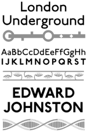
 Originally commissioned in 1916 for use in the London Transport system, Edward Johnston's typeface immediately became an icon in graphic design and typography. Commissioned by first Chief Executive of London Transport Frank Pick to create a typeface belonging unmistakably to the twentieth century, Johnston's design was intended to be distinctly legible and, most importantly, functional.
P22 Johnston Underground
 Utilizing classical Roman capitals as his inspiration, Johnston's letter forms have a corresponding fundamental design. The unique features of Johnston's typeface include the perfectly round 'O,' the perfectly square 'M' (with the center alignment adjoining in the square's exact center) and the trademark diamond shaped dots over the letters 'j' and 'i'. Some of the imperfections found in the wood type have been integrated into the digital version with randomly "dinged" corners which soften the overall geometric feel that sharp corners might otherwise convey in a precise digital rendering.
“New Johnston”
 P22's London Underground font set from 1997 attempts to retain the character and occasional eccentricities of the original Johnston drawings and wood type, later modified in “New Johnston” created by the design firm of Banks and Miles in the early 1980s. Johnston's preliminary face showed several variations on the final letterforms and a few of these alternate designs have been included for optional usage. The true testament to Johnston's legacy of design is its continued modern usage and the scores of imitations which developed from Johnston's work. Johnston's original typeface became the model and inspiration for such modern sans-serif typefaces as Futura and Gill Sans. This set is licensed exclusively to P22 from the London Transport Museum.
P22 Johnston Underground Bold
![]() ‘Underground Railway Block-Letter Bold’ was created with Johnston's advice on the appropriate proportions for a readable bold lettering. There was never a lower case produced for this type, likewise this digital version is upper case only.
‘Underground Railway Block-Letter Bold’ was created with Johnston's advice on the appropriate proportions for a readable bold lettering. There was never a lower case produced for this type, likewise this digital version is upper case only.
P22 Johnston Underground Extras
 The attention to detail in the design of London Transport was not limited to the lettering of Johnston. Everything from the underground stations to the seat cover fabric was intended to work as a whole which went beyond the utilitarian function of a mere transportation system. The extras in this set were culled from various signs and station motifs including tile designs created by Edward Johnston.


No comments:
Post a Comment